Visual Identity
The visual identity of the EMU brand encompasses logos, colors, graphic design elements, and even fonts. Consistency is key in making EMU a recognizable brand. Our brand identity manager sets the standards and monitors brand usage across campus.
Logos
The EMU lettermark logo is to be present on all web pages and print projects. This includes flyers, ads, correspondence, envelopes and department-produced documents (such as newsletters). Any paper document should have the EMU logo and name included. There are sub-brand logos for: Graduate programs, Seminary, Lancaster, CJP, STAR, and athletics.
Graphics and Colors
EMU has developed a distinct graphical style that it uses strategically in its marketing materials to help tell the EMU story visually. The consistent use of these elements is a key part of the EMU brand and is crucial to how its audience recognizes it.

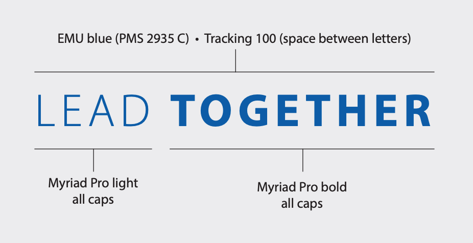
Tagline
Taglines capture the essence of an organization in a nutshell. After the logo, it is the second opportunity to tell someone about our product. No tagline can say everything about an organization. It is a conversation starter. The tagline will be incorporated as determined by the designer. The EMU tagline is modular and can be combined with a variety of messages to help tell the EMU story, but the standard combination should always be LEAD TOGETHER for general uses.
This is just an introduction to the visual identity. EMU brand identity documents give detailed instructions for the use of visual elements of our brand.
